
Why doesn’t my consultancy website generate business leads? 10 common mistakes
I help knowledge-based businesses and organisations get strategic about their content, so their ideas are clearer, visible and more likely to generate the right enquiries.
Book a no-obligation discovery call
Why doesn’t my consultancy website generate business leads? 10 common mistakes.
Your consultancy website can look perfectly respectable and still do very little.
Nice logo. Smart colours. Professional photographs. A sentence somewhere about transformation, performance or unlocking potential.
All fine.
But does it help a potential client find you, understand what you do, trust your expertise and take a sensible next step?
That is the job. Not to sit there looking polished. Not to behave like an online brochure. To help the right person think, “Yes, this is the sort of help we need.”
So why doesn’t that happen?
Here are ten common reasons.
1. Your website is all atmosphere and no useful information
A lot of consultancy websites open with a huge image that is meant to feel impressive.
Snow-capped mountains. Blurry cityscapes. A lone person staring at the horizon. Often there’s a bridge.
The idea is clear enough. The business wants to look serious, ambitious and strategic. But a great stock image can’t tell a buyer who you help, what problem you solve or why they should trust you.
A mountain may suggest growth, but it doesn’t answer a commercial director wondering why the pipeline is weak. A bridge may suggest connection, but it doesn’t explain whether you understand their market, team or problem.
Images can help. Real photographs of your people, clients, workshops, events or work in action can build credibility.
But stock atmosphere cannot do the work your words should be doing. That’s because the web works on words. For the algorithms powering Google and AI, words come first. Yes, sentiment around your organisation is important, but that doesn’t come from images; it comes from what others write about you in testimonials, reviews and other content, including PR that points at your site.
2. Your page headings mean nothing to buyers or search engines
Some consultancy websites use headings that sound confident but say almost nothing.
“Discover the future.”
“Your adventure starts here.”
“Unlock your potential.”
It all sounds polished. It also sounds as if everyone left the strategy meeting slightly too pleased with themselves.
The problem is that buyers do not search like that. Say, I’m the CEO of a business looking for consultancy help; am I really going to type, “discover the future” into Google?
They search for specific problems. They search when something is difficult, expensive, confusing or awkward to explain internally.
That is where long-tail search terms matter. These are longer, more specific phrases that show clearer intent.
So instead of a heading:
“Unlocking operational excellence”
A better choice might be:
“How to reduce operating costs without damaging service quality (in a specific sector)”
Instead of:
“Transformation that delivers”
More useful would be:
“Why is my change programme not delivering the savings promised in the business case”
Those headings are less shiny, but they are more useful. They help the right buyer recognise their own problem. They also give Google and AI systems a much clearer idea of what the page is about.
3. You need to speak like a client, not a consultant
Some consultancy websites sound as if they were written for other consultants.
They are full of acronyms, frameworks, platform names and internal language. It may all be accurate, but it does not always help the person trying to work out whether they need you.
Take SAP.
A page might say:
“Supporting SAP S/4HANA transformation through process optimisation and change enablement.”
That may be technically correct. But the finance director reading it may be thinking something much simpler.
Why is this project late?
Why is everyone confused?
Why is this creating more work instead of less?
A more useful heading might be:
“How to stop your SAP implementation causing delays, confusion and extra work across the business.”
You can still explain the technical detail. But start where the buyer is. Start with the problem they recognise.
4. You don’t answer the questions potential clients are asking
If your consultancy has a blog, and I recommend you have one, start with what your clients are asking, not what you want to talk about.
Consultants have great ideas. But the better question is:
Would someone who looks like your customer search for this because they have a problem you can help solve?
Useful content sits close to the buyer’s pains, gains and to-do list.
What is going wrong?
What change do they need to see?
What’s on their to-do list that needs to be done to move forward?
The best ideas often come from real conversations. Sales calls. Client emails. Workshops. Repeated worries. Objections people raise before they buy.
If one potential client asks a question in a call, there is a decent chance someone else is typing a version of that question into Google or an AI chatbot.
That is how useful content brings people to you before they are ready to appoint a consultant. They may not know which service they need yet. They just know something is not working.
Your content should help them recognise the problem and feel that you understand it.
5. Do your calls to action (CTAs) ask for too much, too soon
There’s nothing wrong with a button saying “Contact us”.
“Book a consultation” is also fine.
But both assume the reader is already close to buying when many leads aren’t.
They may be thinking. Comparing. Gathering ideas. Trying to explain the issue to colleagues. Quietly wondering whether the problem is big enough to do anything about.
So if every page asks for a big leap, many will drift away.
Your content needs to give people opportunities to spend more time with your ideas. Getting to know you, seeing the signals that indicate you know what you’re doing and you’re trustworthy.
That might mean reading a related article. Joining a nurturing newsletter. Downloading a useful guide. Watching a video. Listening to a podcast. And then maybe, booking a no-obligation discovery call when they are ready.
The point is to make the next step feel natural. This is where your content can do all the heavy lifting for you. Nurturing those top-of-funnel prospects until they’re ready to talk.
6. Your contact details are difficult to find
Interested buyers should not have to go on a small expedition to find your contact details.
If someone is reading a service page, case study or article and thinking, “This sounds like us”, the next step should be obvious.
That might be a phone number, email address, contact form or booking link. It needs to be right in front of them when they naturally need it.
Your contact page is useful, but it should not be the only place a buyer can act.
When hovering over the contact button or form, state clearly what will happen next. Think psychological safety.
Someone will be in touch quickly to arrange a no-obligation call. They won’t receive a sales pitch. They won’t be added to a spammy mailing list, they won’t be pestered by a salesperson.
If getting in touch is low risk, people are more likely to contact you.
7. You leave important questions and objections unanswered
Before someone contacts a consultant, they often have private questions.
- How much might this cost?
- What does the process look like?
- How long will it take?
- Is this right for our situation?
- Have you worked in my sector?
If your website avoids those questions, the buyer has to sit with the uncertainty. Some will contact you anyway. Many will not.
An FAQs section can help to reduce this friction. They make the next step feel less risky. They also show that you understand what buyers are worried about before they have to ask.
This does not mean answering every possible question in painful detail. It means addressing the obvious doubts that stop people from making contact.
8. Potential clients never get to meet you
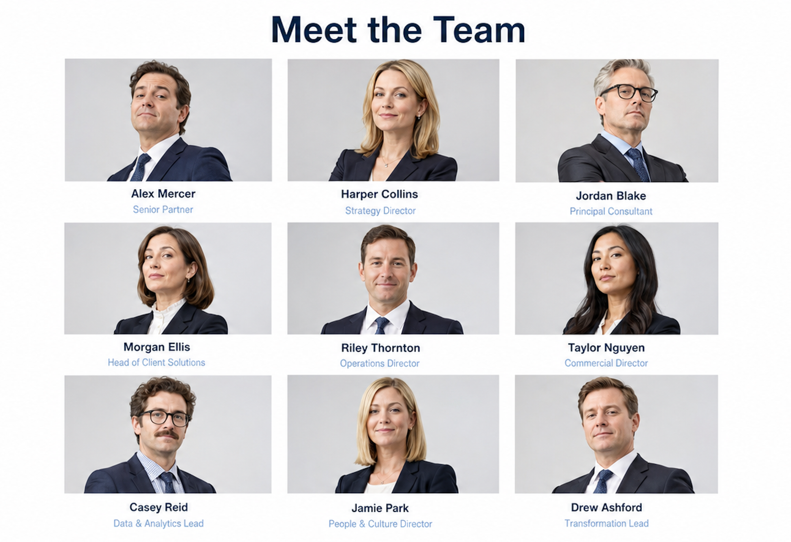
Does your site have a meet the team page with a grid of headshots? That’s not really meeting the team.
If you sell consultancy, coaching, advice or expertise, people are buying your judgement. They want to know how you think, how you explain things and whether they would feel comfortable working with you.
That is where video, podcasts, interviews and webinar clips can help.
They let people hear your ideas before they speak to you. They get a feel for your tone, opinions and communication style. That can make a first conversation feel much less risky.
But do not leave your best thinking trapped inside an audio or video file.
Give it a written home. Add a clear title, short introduction, useful headings, summary and edited transcript. That helps people skim before they commit. It also gives Google and AI systems text they can understand.
A good recording can build trust. A good page around that recording helps people find it.
9. Your testimonials say too little
“Great service, highly recommended” is pleasant.
It is also not very useful.
A strong testimonial gives the next buyer something specific to believe. It explains what was happening before, why the client needed help, what the experience was like and what changed afterwards.
Names, job titles, organisations and photos can add credibility where appropriate. Anonymous praise is easier to ignore because it feels detached from real evidence.
Also, do not hide your best testimonials inside rotating images or graphics. These can be invisible to search and AI.
Visitors may miss them. Search engines may struggle to read them. AI systems may not understand them properly.
Use proper text. Give testimonials space. Pull out the useful detail.
A good testimonial does not just say you did a great job. How commercially useful were you? What problems did you fix? It helps a potential client think, “That sounds like the situation we’re in.”
10. You don’t provide enough evidence that you can deliver
Testimonials are useful, but they are only one form of proof.
A consultancy website should reduce the buyer’s sense of risk.
That proof might include client logos, awards, accreditations, media appearances, detailed case studies, measurable results, speaking engagements or published work.
Case studies are especially useful because they show your thinking in action. A good one explains the challenge, your approach and what changed.
Do not hide proof on one lonely testimonials page. Put it where people are making decisions: your homepage, service pages, case studies, articles and near calls to action.
A potential client is not only asking, “What do they do?”
They are asking, “Can I trust them with something important?”
Your website needs to answer that.
Conclusion
A consultancy website does not need more decoration or cleverer slogans.
It needs to help the right people find your expertise, understand it and spend time with your ideas before being asked to buy.
That means clearer language. More useful content. Stronger evidence. Better next steps.
Because a lead rarely starts with someone admiring your homepage.
It starts when someone recognises their problem and thinks, “These people seem to understand what we’re dealing with.”
I help knowledge-based businesses and organisations get strategic about their content, so their ideas are clearer, visible and more likely to generate the right enquiries.
Book a no-obligation discovery call

I help knowledge-based businesses and organisations get strategic about their content, so their ideas are clearer, visible and more likely to generate the right enquiries.
Book a no-obligation discovery call
Read next!
Are meet the team pages pointless? I’d rather meet their expertise
Jul / 2026Why doesn’t my consultancy website generate business leads? 10 common mistakes
Jul / 2026
How to grow your podcast audience with SEO and expert content so people find you on Google and AI
Jul / 2026
How do I stop guessing what to blog about and choose topics based on customer intent?
May / 2026
Why do potential customers read my blog but not contact me?
May / 2026
Should I use Substack for my business blog? Why it might not be the right solution if you are seeking higher value leads and conversations
May / 2026
Why will social proof like testimonials, case studies and awards help drive more leads and enquiries to my business?
May / 2026
What are long-tail SEO keywords and how can a knowledge-based business use them to attract better leads?
May / 2026